
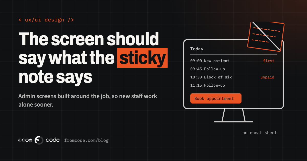
Picture a physiotherapy clinic on a Monday morning. A new receptionist starts today. The booking system is the one the clinic has used for years, and on her monitor there is already a yellow sticky note from the person before her: *"New patient: fill the boxes marked in pen. Ignore the rest. Never press Archive."*
By ten o'clock she has a printed page of screenshots with arrows on it, a colleague who answers the same three questions every half hour, and a queue at the desk. Nothing is broken. Every screen works exactly as it was built. It was simply built around the database, and she is trying to do a job.
This is one of the most common and least discussed costs in a small business: the screens your own staff use all day. Customers never see them, so they rarely get the attention a public website gets. Yet they decide how long a new person needs before working alone, how many mistakes reach your records, and whether people quietly go back to a spreadsheet. This article follows that clinic from the sticky note to screens a new person can use on the first morning, and what you can ask for when you commission or fix your own.
Start with the sticky notes
The sticky note on the monitor is the most honest document in the building. It says which fields matter, which buttons are dangerous, and which steps the system makes people do that the job does not need.
Before anyone redesigns anything, collect them. The notes, the printed cheat sheets, the "how to do month-end" document on the shared drive, the spreadsheet that sits open next to the system all day. Each one marks a place where the screen asks people to remember something it could have told them.
In the clinic, that collection is short and revealing: which boxes a new patient needs, how to move an appointment without losing the payment, how to find who has not paid for a block of sessions, and a warning about the Archive button. Four notes, four jobs the screens make harder than they need to be. That is already a brief.
Screens shaped like the job, not like the database
Most admin screens are shaped like the database behind them. There is a Patients screen with every field a patient record has, an Appointments screen with every field an appointment has, a Payments screen, and so on. That is natural for the person building it, because that is how the data is stored.
Staff do not think in tables. They think in jobs: *book a new patient*, *move Thursday's appointment to next week*, *take payment for a block of six sessions*, *see who is coming this afternoon*. Each of those jobs touches two or three tables at once, so on a table-shaped system it means three screens and a memory of which sequence to visit them in.
A screen built around the job puts what that job needs in one place. Booking a new patient asks for the handful of details needed to book, finds a free slot and confirms it, all on one screen. The full patient record still exists, one click away, for the day someone needs it. Nothing is lost; the everyday path just stops being a tour of the database.
The ten things done every day
A useful exercise is to list everything people do in the system and mark each job daily, weekly, monthly or yearly. The daily list is almost always short, and it is where nearly all the time is spent.
Those daily jobs deserve the best spot on the screen and the fewest clicks. Sensible starting values help too: the appointment length the practitioner usually works with, today's date, the practitioner who is logged in. Every value filled in for them is a decision nobody has to make forty times a day.
The yearly jobs, such as changing a price list or closing the year, can live one level deeper, behind a clearly named menu. They stay visible and easy to find; they simply stop competing for space with the things people do every hour.
Words from the work
Read your admin screens out loud and listen for words nobody at the clinic would say. *Entity*, *record type*, *status 3*, *client_category*, *Process*, *Submit*. They come from the software, and each one turns a simple question into a small act of translation.
Use the words staff already use with each other and with customers. If the reception says "block of sessions", the screen says "block of sessions", not "package". If the clinic calls it "no-show", the status is "No-show", not "Cancelled (late)". Buttons say what will happen: "Book appointment", "Move to next week", "Send reminder now", rather than "OK" or "Save".
This costs almost nothing to fix and does more for a new person than any manual, because the screen now describes the job in the language of the job.
A first screen that answers the morning question
The first screen people see in the morning should answer the first question they have in the morning. At a reception desk that is usually *who is coming today, and is anything wrong with it?* For a workshop it might be *which jobs are waiting for parts*. For a school office, *who is absent and has not been reported*.
So instead of opening on a menu or on an empty search box, the system opens on that list: today's appointments, the unpaid ones marked, the first-time patients flagged so the receptionist knows to hand over the form.
Every list also says plainly what it is showing. "Today, all practitioners, 23 appointments" at the top of the list means nobody has to wonder whether a filter from yesterday is still on, or whether the list is complete. A list that states its own filter is a list people can trust.
Messages that say what to do next
Compare two messages after someone types a phone number with a space too many:
- *"Invalid input."*
- *"The phone number has one digit too many. Check the number and try again."*
The first stops the person. The second tells them what happened and what to do, and it keeps everything else they typed exactly as it was. Good admin screens check as people go, next to the field in question, instead of waiting for the final button and then clearing half the form.
The same goes for warnings that protect your records. "This patient already has an appointment at 14:00 with another practitioner. Book anyway?" is a sentence a new receptionist understands on the first day, and it prevents a double booking far better than training ever will.
Make it safe to try
People learn software by trying things. They learn it fastest when trying is safe.
That means the system lets them undo the common actions: move an appointment back, restore a record they removed, reopen a payment they closed by mistake. It asks for confirmation only before the few actions that are genuinely hard to reverse, and it says in that confirmation exactly what will happen ("This removes the patient and their 14 appointments. Their payment history stays."). When every button asks "Are you sure?", people click Yes without reading; when only the important ones do, people read them.
A visible history on each record helps everyone relax: who changed what, and when. A new person who knows a mistake can be seen and put right explores the system with confidence. In the clinic, the Archive button stops being a legend on a sticky note and becomes an ordinary, clearly described action with a way back.
Sit next to one member of staff and ask them to do five ordinary jobs on the system while you watch, without helping. Book a new patient, move an appointment, take a payment, find who has not paid, print the day's list.
Write down every pause, every question, every time they open the cheat sheet. Half an hour of watching one real person usually shows more than a month of guessing, and it costs nothing but the half hour. Do it again with someone in their first week, and you see the screens through the eyes of every future hire.
Fast for the people who use it all day
"Easy to learn" and "fast for experts" sound like opposites. In practice the same screens can be both, if a few things are in place.
Search that finds a patient, an appointment or an invoice from one box, by name, phone or number, saves more time than any menu. Keyboard shortcuts for the daily jobs let the person who has used the system for five years fly through it, while the buttons stay visible for the person in their first week. Remembering the last filter, the last practitioner and the last date range means nobody sets them up again after every visit to another screen.
Screens used on a tablet in a treatment room, a workshop floor or a warehouse need room for a finger. The W3C's accessibility guidelines, WCAG 2.2 (a W3C Recommendation since October 2023), set a minimum of 24 by 24 CSS pixels for anything people tap or click, with exceptions for well-spaced targets. For a screen used standing up, with gloves or in a hurry, bigger is kinder still.
One step at a time for the rare, complicated jobs
Some jobs are complicated and rare: setting up a new practitioner with their hours and rooms, changing the price list, preparing the year-end figures. Nobody remembers how to do them, because they happen once or twice a year.
For those, a step-by-step flow works far better than one long form. The public GOV.UK Design System recommends starting with one question per page, because it helps people understand what is being asked and focus on that answer. The same idea suits a rare admin job: one step per screen, a clear "step 2 of 5", and a summary at the end to check everything before it is saved.
The daily jobs stay compact and quick; the yearly ones hold the person's hand. Each gets the shape that suits how often it happens.
Each role sees its own work
A receptionist, a practitioner and the owner do different jobs, so their screens can show different things. The receptionist opens on today's bookings and payments. The practitioner opens on their own patients and notes. The owner sees the figures and the settings.
This is not about keeping secrets; it is about keeping each person's screen to their own work. A menu with forty entries, of which a person uses six, is forty things to read every time. A menu with their six, plus a clear way to ask for more access, is a screen they learn in an afternoon. As a pleasant side effect, the payroll screen and the price list are no longer one wrong click away from the front desk.
What to ask for
If you are commissioning a new system, or improving the one you have, a few requests in the brief make a large difference:
- A list of the jobs, not the features. Who does each one, and how often. The developer can then shape the screens around the daily ones.
- Your words. A short glossary of the terms your staff use, so the labels match the work from the first version.
- A walkthrough with real staff before the screens are finished. A clickable sketch tested with the person who will use it catches problems while they are still cheap to change.
- A measure of success that is about people. For example: "a new receptionist can book, move and take payment for an appointment on her first morning, without the cheat sheet." It is easy to check, and it keeps everyone focused on the job.
- Undo and history for the everyday actions, and a clear description on the few that cannot be undone.
None of this needs a large design project. It needs the screens to be planned around the people using them, which is something any good developer is glad to be asked for.
The same Monday, a few months later
Back at the clinic, a few months later. The booking screen opens on today's list, with unpaid sessions marked and first-time patients flagged. Booking a new patient is one screen with six fields. Moving an appointment is a drag to the new slot and a message offering to text the patient. The Archive button is now called "Remove patient", explains what it keeps, and can be undone for thirty days. Search finds anyone by name or phone from the top of every page.
The next new receptionist still gets a welcome and a tour. What she does not get is a sticky note, because the screens now say what the note used to say. Her colleagues get their half hours back, the records stay cleaner, and the spreadsheet beside the system quietly closes for good.
That is the real measure of an admin screen: how soon a new person can do the job well, and how pleasant it is for everyone else to do it every day after.
Which screen does your team keep a cheat sheet for?
Discuss your projectTell me what the job is and who does it, and I will show you how the screen could carry it.